Mana
Mana Services is a vital and growing organisation operating in a competitive sector and facing a range of differentiation challenges.
The challenge was to create a brand that would have broad appeal for culturally diverse audiences – from rangitahi to government, highlight the business's sophisticated model for delivering a breadth of services, and enable the brand to extend its services, while still preserving important cues to its heritage.
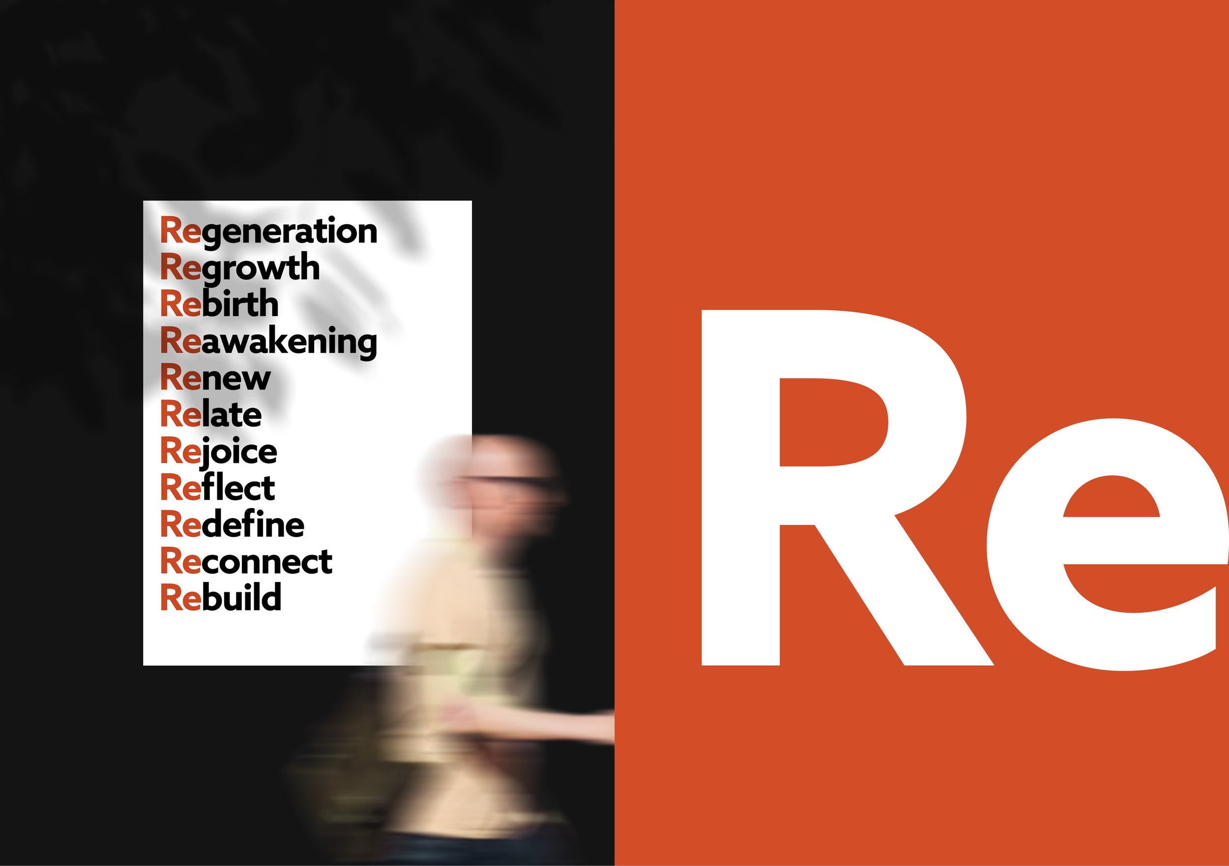
The core brand mark (logo) was retained but enhanced, and a new colour palette, graphic and language system was created to deliver a visual and brand narrative that would enable Mana to tell its story with greater confidence.
The colour palette is grounded in black and white and introduces reddish brown (Whero) to create an association with mana and rank, while dark green references the precious and powerful stone – pounamu. The graphics and typography are friendly, accessible and imbued with confidence to reflect Mana’s strong presence and influence, while the brand language, predicated on ‘re’ and ‘new’, signals the transformative outcomes that Mana delivers. Hero images have been styled to create another layer of differentiation and a powerful connection with rangitahi.
Services
Discovery
Strategy
Branding
Communication
Copywriting
Digital


