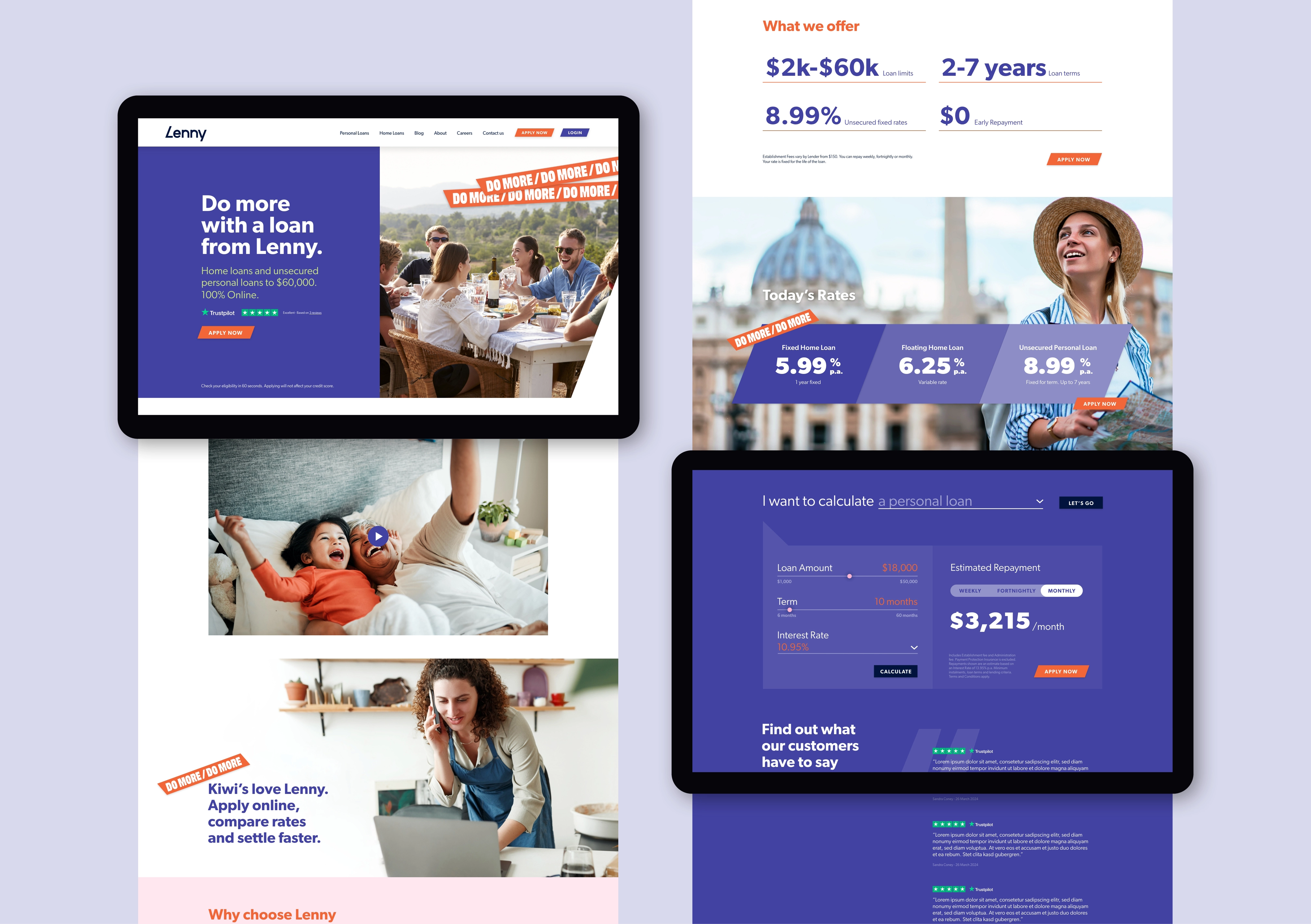
The business was launching a new, fully digital lending platform powered by smart AI tech to offer various customised personal and home loan solutions. The brand needed to quickly build recognition and awareness about the new service, particularly a range of key features that were not only different but also a compelling proposition for consumers.
Following discovery and definition, a new name started the design and delivery phase. Lenny ticked a lot of boxes - the name suggested a subliminal association with ‘lend’, while the proper noun was a friendly-sounding name that felt highly approachable.
The logo/brand mark is a custom-built font. The simple and elegant letter forms elevate the unique qualities of the name Lenny – friendly, accessible and trusted. The treatment of the ‘L’ letterform communicates speed and agility and invites prospective brokers and borrowers to ‘lean in’ to the Lenny lending proposition.
The secondary graphic system delivered a suite of creative assets for use across multiple applications, while the ‘Do More’ tagline lock-up was designed to be executed across a wide variety of applications and in a variety of ways.
The rollout included environmental and digital displays, digital assets—portal and website—social media templates, signage, and corporate collateral.


